Wear Prints with Ease: A Simple Outfit Checklist
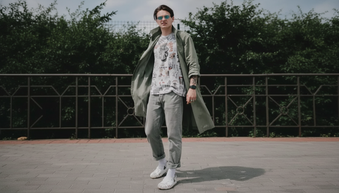
How to Add Prints Without Overdoing It: A Style Checklist for Effortless Outfits
Prints can make an outfit feel polished and interesting—until they start competing for attention. The easiest way to look intentional is to control scale, color, and where the pattern sits on the body. Use the checklist below to add prints in a way that still feels effortless, wearable, and distinctly “you.” For more guidance, see brunch outfits – Rice University.
The three anchors: scale, color, and breathing room
- Scale: Let one print lead and keep the rest supportive. If you mix prints, make sure at least one is noticeably smaller or larger so the outfit reads as styled, not cluttered.
- Color: Cap the look at 2–3 main colors (plus neutrals). When palettes relate, patterns look coordinated instead of random. If you want a quick framework, color guidance tools like Pantone’s color systems can help you spot undertones and harmony.
- Breathing room: Add solid “rest zones” so the eye has a place to land—think a plain blazer, clean trousers, or simple shoes.
Start with one printed piece and build outward
- Choose one focal item: a printed top, skirt, trousers, dress, scarf, or bag—just one to begin.
- Ground it with a neutral base: denim, black, cream, navy, and chocolate make most patterns instantly wearable.
- Repeat one color from the print: echo a shade in shoes, a bag, a belt, or earrings to make the outfit feel finished without adding extra noise.
If you prefer a “grab-and-go” approach, the How to Add Prints Without Overdoing It – Style Checklist for Effortless Outfits is a ready-to-use guide you can keep on your phone for quick outfit decisions. For further reading, see What Should I Wear? The Ultimate Guide to Workplace Dress Codes.
Where the print sits matters more than the print itself
- High-impact zones: Prints near the face (tops, scarves) read louder. Keep the rest quieter—clean denim, solid trousers, minimal jewelry—to balance the “volume.”
- Low-impact zones: Printed trousers or skirts can feel calmer than expected when paired with a simple top and streamlined shoes.
- Silhouette first: If the cut is dramatic (wide-leg, voluminous sleeve, oversized blazer), pick a calmer print or a tighter color palette so the shape stays the star.
Easy print types that rarely feel “too much”
- Stripes: Classic and graphic—easy with denim, crisp shirts, and tailoring.
- Small florals/ditsies: From a distance they read like texture, which makes them forgiving and everyday-friendly.
- Polka dots: Playful but structured; keep accessories simple for a clean finish.
- Subtle animal print: Treat it like a neutral when it’s muted (black/cream, brown/tan). For runway-to-real-life inspiration, browse styling coverage from sources like Vogue and then simplify the final look for daily wear.
Mixing prints without chaos: a simple rule set
- Match at least one shared color across both prints (even a small accent counts).
- Vary the scale: one small, one medium/large; avoid two equally loud mid-scale prints.
- Keep one print simple: stripes, dots, or a subtle check make the best “supporting” patterns.
- Limit printed items to two: keep everything else solid—outerwear, shoes, bag, and belt.
| Base print | Best partner | Keep it balanced by |
|---|---|---|
| Stripes | Floral (small) or leopard (subtle) | Matching one color; solid shoes |
| Polka dots | Stripes (different width) | One print in neutral; minimal jewelry |
| Floral (large) | Solid or micro-dot | Let floral be the hero; clean layers |
| Plaid/check | Graphic tee or thin stripe | One shared tone; structured outerwear |
Outfit formulas that always look intentional
- Printed top + straight-leg jeans + solid blazer + simple sneakers or loafers.
- Printed skirt + fitted knit top + neutral belt + streamlined boots.
- Printed dress + solid jacket (denim, leather, or tailored) + one-color bag.
- Two prints max: striped tee + floral skirt, then a neutral cardigan and neutral shoes.
When you want to feel pulled together quickly (especially on low-energy mornings), pairing a style checklist with a simple confidence routine can help. Two easy digital add-ons that pair well with a “get dressed with less overthinking” mindset are Speak Success: Your Power Words Action Checklist and Break Free: Stop Self-Sabotage Today.
Common ways prints get overdone (and quick fixes)
Style checklist for effortless printed outfits
- One hero print chosen (yes/no).
- Palette limited to 2–3 colors plus neutrals (yes/no).
- At least one solid “rest zone” added (yes/no).
- If mixing prints: shared color + different scale (yes/no).
- Accessories simplified to avoid competing statements (yes/no).
- Shoes and bag kept clean and streamlined (yes/no).
- Final mirror test: the print is noticed first, the outfit second, the person always (yes/no).
- For a ready-to-use version that can be saved or printed, use the downloadable checklist here: Style Checklist for Effortless Outfits: How to Add Prints Without Overdoing It.
FAQ
How many prints can be worn in one outfit without it looking busy?
One print is the easiest option for an effortless look. Two prints can work when they share at least one color, differ in scale (one smaller or larger), and the rest of the outfit stays solid.
What colors make prints easier to style every day?
Neutrals like black, cream, navy, denim, and brown make most prints feel wearable immediately. Repeating one color from the print in your shoes or bag also makes the outfit look cohesive without adding more pattern.
Can bold prints work in a work outfit?
Yes—keep the silhouette clean and pair the bold print with tailored pieces like a blazer, straight-leg trousers, or a structured skirt. Minimal accessories and classic prints like stripes, small florals, or subtle animal print tend to look especially polished at work.


Leave a comment