Add One Print to Any Outfit Without Looking Busy

What is the easiest way to add one printed piece to an outfit without looking busy?
Answer
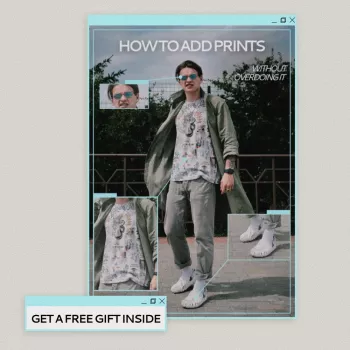
The simplest way is to pick one print, then keep everything else quiet and coordinated. Start with a single printed “hero” item—like a striped tee, a floral skirt, or a checked scarf—and build the rest of the look from solid colors pulled from that print. When the print has room to breathe, it reads intentional instead of noisy.
For an easy formula, try: one printed piece + two to three solids + one neutral. Neutrals (black, white, denim, camel, navy) act like a frame, while a matching accent color from the print makes the outfit feel pulled together without adding more pattern.
To keep it from looking busy, watch the scale and placement. A small-to-medium print is generally the most forgiving, and placing the print on one area (top or bottom) helps your eye settle. If you’re new to prints, choose a classic pattern—stripes, subtle gingham, or micro florals—in a limited palette.
Finish with simple accessories. Let the print do the talking and keep jewelry sleek, shoes solid, and bags minimal. If you want a little extra polish, repeat one color from the print in a single accessory (like a belt or shoe) rather than adding another patterned item.
For more quick outfit checks and print-pairing tips, follow this guide: https://emperalle.com/guide-wear-prints-with-ease-simple-outfit-checklist/
For Add One Print to Any Outfit Without Looking Busy, the best answer depends on fit, material, care instructions, and how the product will be used day to day.
Checking those details first helps avoid a poor match and keeps the choice practical after delivery.
FAQ
How do you choose a print that’s easy to style?
Look for a print with only two to three colors and a classic motif like stripes, small checks, or subtle florals. The fewer colors in the pattern, the easier it is to match solids without the outfit feeling loud.


Leave a comment